If you’re a Mac user, then there’s a good chance you’ve heard of macOS Big Sur before. It’s the latest version of macOS and possibly the most radical redesign in a decade. Nearly everything is different, which is as much fun as it is a headache.
In this post, we’ll briefly cover the changes in macOS Big Sur (you can read a more in-depth review of these changes here) and then get into some more subtle changes that might change the way you use your Mac. Hopefully, this article helps ease you into what is sure to be a jarring update for many.
The first thing anyone will notice in this update is the redesign. While it’s still unmistakably macOS, just about every aspect of the interface has been updated. Every app icon, menu, the dock, Spotlight, Safari – everything looks different.
But it also kind of looks the same.
That’s because Apple (finally) redesigned macOS to look like the iPadOS and iOS counterparts. Now, the Mail app on all three platforms looks the same, as does the Messages app, Safari, and so on.
These apps all also get the classic rounded square template from iOS. The difference, however, is that apps can still break this convention. The magnifying glass on the Preview icon, for example, goes outside the bounds of the rounded square.
Despite how different everything looks on the surface, most of the core interface is largely the same. So don’t get too overwhelmed by the dramatic change in appearance – it’s mostly cosmetic.
The Control Center and Notification Center
That said, there are some deeper changes to the macOS interface. Namely, Apple has added a Control Center to Mac and redesigned the Notification Center.
The new Control Center is accessible from the Menu Bar and is indistinguishable from the Control Center on iOS. While there’s some debate on whether or not this is easy to use on a computer, it at least works the same as it does on iPhone. So if you’re familiar with the Control Center on iPhone, you shouldn’t have too hard of a time adjusting to this.
The Notification Center has also been updated to mimic the Notification Center on iOS, though it’s less of an interface change than the Control Center. The one thing this will change is widgets, which are now much closer to the widgets Apple added in iOS 14 (more on this later).
A Safari overhaul
Lastly, while there are more changes throughout the operating system, the last major change is Safari. This is yet another area of the interface where everything will feel different, but also very familiar.
Apple essentially overhauled Safari on Mac. The interface is slightly different, tab management is greatly improved, and everything is much, much faster. I’ve been running Big Sur for a few months now, and even when the macOS Big Sur beta was buggy and laggy, Safari was still able to load webpages almost instantly. I don’t know enough about programming to know how they pulled this off, but needless to say, you will notice a massive jump in how quickly pages load once you update.
Safari is now more customizable and secure as well, which I’ll get into further below. Out of everything I’ve experienced in this update, Safari is by far my favorite change.
How to adjust to macOS Big Sur
So with the big changes out of the way, it’s time to get into the smaller details that you’ll notice as you start to use this interface more. I’ve been running the Big Sur beta for a while now, so I should be able to offer some insights into what you can expect to be different. Some of these will be nitpicks, while others will be cool features you’ll enjoy trying out.
Be prepared for dropdown menus
Let’s kick it off with a nitpick. For some reason, Apple decided to make all of the text and buttons in macOS 11.0 slightly bigger. I have a hunch that this is because they are planning on launching a touchscreen Mac soon, and this makes the interface fingertip-friendly.
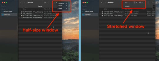
However, if you’re still using a mouse or trackpad (Spoiler: That’s everyone) then this can kind of be annoying. For example, let’s say you have a lot of Menu Bar icons. Before Big Sur, these would sometimes cut off the Menu Bar options, like Help and Window, because they simply took up so much space.
Now, that happens much, much more often. That’s because the Menu Bar buttons and icons both take up more space. So when you open an app like Safari, which has lots of Menu Bar tabs, your Menu Bar icons are going to start being cut off.
Likewise, any app with buttons in the toolbar (Preview, Mail, Finder, etc.) is going to rely on dropdown menus when the app windows are half-size. This is a bit tough to communicate in writing, so here’s a comparison screenshot to show what I mean:
The system is far more reliant on dropdown menus and bigger windows, both of which feel like clutter. The excessive white space is a bit annoying and will take a while to ignore.
Get used to the Control Center
In macOS Big Sur, the Control Center is non-optional. And to be honest, I don’t like it. I’m usually not a naysayer when it comes to Apple’s design decisions, but this choice just doesn’t make much sense to me.
The Control Center was made to be used by fingers, not by a mouse or trackpad, and it shows. Apple copied and pasted it to macOS, and it feels awkward, like using a mouse on your iPhone. The placement of Control Center also feels a little off (the very top-right of the screen) and I think it would benefit from being mapped to a gesture or keyboard shortcut.
That said, it now holds a lot of the key features and settings you frequently adjust on Mac. So be prepared to use this feature a lot in Big Sur.
New widgets in Notification Center replace the old widgets
Anyone with an iPhone is surely familiar with the new widgets in iOS 14 by now. They’re taking over home screens and changing the way we use iPhone. Well, now they’re on Mac.
Again, Big Sur has basically copied and pasted this feature right from iOS. The widgets look and act nearly identical. The big differences here are that they are confined to the Notification Center and aren’t stackable.
I really like this change – the widget tiles look great and are easy to move around. One thing you will need to be aware of, though, is that this update breaks all previously existing widgets. So if you were using any third-party widgets before, those apps will need to update their widgets, or else you’ll lose them. Big Sur officially releases tomorrow and I still only have widgets for the stock Apple apps.
Expect some lag on older machines
macOS Big Sur has had the toughest beta period of any macOS release in a while, largely due to how much has changed. While it’s much smoother today and certainly feels ready for the general public, I’d be lying if I said I didn’t notice any performance decrease in my Mac.
I’m running Big Sur on a 2017 base-specs MacBook, and have noticed a significant drop in performance since upgrading. Not enough to make my Mac unusable or frustrating to use, but it’s the first time I’ve gotten an update and noticed that my Mac feels “old”, even though it’s barely three years old.
I would imagine that anything much older than 2017 is going to notice a performance drop as well, especially if it has lower specs like my Mac does. Again, it doesn’t even come close to ruining the Mac experience, but my Mac has certainly grown out of the sleek, snappy thing it was when I first got it.
Customize your start page in Safari
On a less, “I’m old, everything is different!” note, one of the really nice changes in macOS Big Sur is the new start page in Safari. Before, you could choose between showing your Favorites or preloading a webpage. Now, however, you can create a very customizable start page that looks and acts personal.
First, you can change your Safari start page background to an image of your choice. It’s like having two desktop wallpapers, and I certainly enjoy getting to see two pictures of Austin while using my Mac.
Second, there’s a little options icon in the bottom right where you can choose what does and doesn’t appear on your start page. Mine is pretty simple – I like seeing my Favorites and how many trackers Safari has blocked recently. You can add Frequently Visited, Cloud Tabs, and Reading List as well.
I think this is a pretty decent set of options, though I might’ve found a way to incorporate bookmarks, bookmark folders, the weather, etc. But it’s a great start!
Better search everywhere
When I first transitioned to Mac in 2017, the feature that blew me away more than any other was Spotlight. The simple shortcut of cmd + spacebar became second nature very quickly, and I found myself using it for everything. If everything on my Mac went wrong except for this feature, I probably still wouldn’t go back to Windows. It’s the best.
In macOS Big Sur, Spotlight search has not only been improved, but it’s also replaced nearly every other search on the macOS platform. The search in Finder, Pages, Safari, and more now uses Spotlight as the underlying engine. That means in-app search features are now just as fast and robust as Spotlight is.
No complaints or suggestions here, this is a perfect polishing up of the OS.
Automatic AirPods switching
Another handy feature that Apple has added is automatic AirPods switching between devices. Once you update to macOS Big Sur, you’ll be able to jump from your iPhone to your Mac to your iPad without needing to disconnect and reconnect your AirPods as you go.
I don’t have a pair of AirPods to test this with myself so I can’t speak to its potency, but I imagine it’s fairly smooth and a real treat for AirPods users everywhere.
Is macOS Big Sur the biggest macOS update yet?
Honestly, I haven’t been through enough macOS updates to say for sure, but it certainly seems that way. Apple left no stone unturned in this update, and I’m truly impressed with how stable and polished it turned out to be. It was a long and buggy beta period, but I can say that for the most part, I really like this change and look forward to seeing what Apple does with it in the next macOS update.
See you then!
FAQs
How do I update to macOS Big Sur?
Open the System Preferences app on your Mac, click Software Update, and then click Install. The process should take anywhere from fifteen minutes to an hour.
I am usual one to try these new releases in beta but this time around I didn’t but I did upgrade from Catalina to Big Sur a week or so ago. After a couple days I was ready to go back to Catalina and that release was not a real favorite of mine. But at least my printer worked, and the UI was a more traditional MacOS even OSX like. Yes, I have been using Mac’s since the Power PC chip days pre Intel and still think a Mac should be a Mac not a sort of iPad thing with IOS interface traits. Big Sur isn’t over bearing in IOS influence but I see the writing on the wall. I will stick with Catalina for awhile and see how this Big Sur matures.
After downloading Big Sur Safari kept dropping, and still does. Hope this can be fixed. I dont have this trouble on chrome. I’m playing background music (and the words not all) are adding themselves hello to this letter. you bring hello. Doris Day!
I switched to Apple from PC’s because I was tired of the almost weekly Microsoft updates; and I
thought why can these software people not write their programs and test their code before putting it
in the market place. Sad to say, Apple has become the same way. I have had so many problems with
the Apple computers – from the black screen of death – to you name. And when this one goes, I will
not buy another Apple Product! I am not downloading Big Sur!
Big Sur has many issues with legibility within the new User interface you can tell it was designed by twenty something kids. White grey over a white background?? What were they thinking? Contrast is the key to legibility. Even the fonts are basically a light grey now?? Sadly Tim Cook is so hands off as a CEO he’s basically just worried about the bottom line. Some of the new aspects of Big Sur could be really good. But the bad choices have just ruined it for me.
Sorry Apple. Not going to jump this train. Shows that this OS is becoming more touch screen and Tim should had waited until the models were available. I’ll stay where I am.